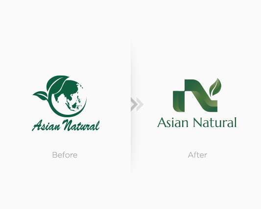
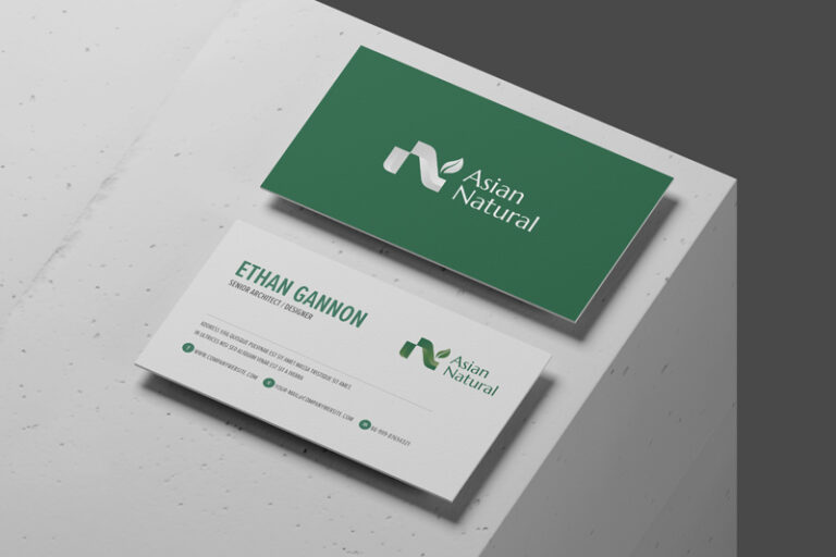
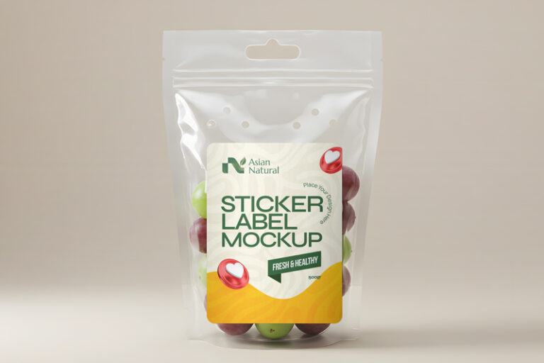
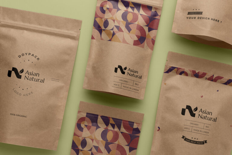
Asian Natural provides structured market access and distribution across East and West Malaysia’s retail ecosystems. The redesigned logo transforms the brand identity into a sleek, modern letter “N,” representing connection and seamless distribution flow. Nestled at the top corner, a vibrant leaf subtly highlights the brand’s foundation in food, natural products, and FMCG retail. This minimalist concept balances professional reliability with a fresh, nature-driven approach.